matplotlib
导入
import matplotlib.pyplot as plt
import numpy as np
画图
# 简单的绘图
x = np.linspace(0, 2 * np.pi, 50)
# 设定图像的大小
plt.figure(figsize=(10,5))
# 如果没有第一个参数 x,图形的 x 坐标默认为数组的索引
plt.plot(x, np.sin(x))
plt.show() # 显示图形
调整label字体大小
plt.xlabel("time",fontsize=20)
plt.ylabel("DO",fontsize=20)
plt.xticks(fontsize=20)
plt.yticks(fontsize=20)

# 调整全部字体大小
matplotlib.rcParams.update({'font.size': 22})
指定字体
import matplotlib.font_manager as fm

font_path = '/usr/share/fonts/winfonts/times.ttf'
font_prop = fm.FontProperties(fname=font_path)

plt.xlabel('pH', fontproperties=font_prop)
plt.ylabel('Turbidity', fontproperties=font_prop)
调整横坐标数值
x=[1,2,3,4,5]
plt.xticks(np.arange(1, 6, 1))
plt.plot(x, np.sin(x))
强制显示横坐标
plt.tight_layout()
调整横坐标间隔
ax = plt.gca()
# 横坐标显示的日期
ax.xaxis.set_major_formatter(mdata.DataFormatter('%Y-%m-%d'))

plt.xticks(pd.data_range('2018-9-1','2018-11-30', freq='10d'))
plt.yticks(range(20, 110, 10))

# 横坐标显示数字
import matplotlib.ticker as plticker

fig, ax = plt.subplots()
ax.plot(x,y2, color='r')
# this locator puts ticks at regular intervals
loc = plticker.MultipleLocator(base=12.0)
ax.xaxis.set_major_locator(loc)
ax.set_title("公司财务数据缺失百分比折线图"+factor_name)
ax.set_xlabel('时间')
ax.set_ylabel('百分比')
调整线条颜色
x = range(len(data))
# 调整图像大小
plt.figure(figsize=(10,5))

# 绘制曲线
plt.plot(x, y1, label="actual")
plt.plot(x, y2, color='r',label="prediction")

# 设置坐标轴范围
plt.xlim((-5,5))
plt.ylim((-2,2))

#设置坐标轴刻度
plt.xticks(np.arange(-5, 5, 0.5))
plt.yticks(np.arange(-2, 2, 0.3))

# 手动修正坐标轴刻度
plt.yticks([-0.25, 0, 0.25, 0.50, 0.75],['-0.25', '0', '0.25', '0.50', '0.75'])

# plt.legend()添加标注
plt.legend(loc="upper left")
# 自动调整标注位置
plt.legend(loc="best")

plt.title("上证50指数历史最高价、收盘价走势折线图")
plt.xlabel(Time Slot Count")
plt.ylabel("value")

plt.show()
散点图
N = 50
x = np.random.rand(N)
y = np.random.rand(N)
colors = np.random.rand(N)
area = (30 * np.random.rand(N))**2  # 0 to 15 point radii

plt.scatter(x, y, s=area, c=colors, alpha=0.5)
plt.show()
subplots
#First create some toy data:
x = np.linspace(0, 2*np.pi, 400)
y = np.sin(x**2)

#Creates just a figure and only one subplot
#fig 是整体图形,ax是分别的图形
fig, ax = plt.subplots()
ax.plot(x, y)
ax.set_title('Simple plot')

# 调整子图大小
fig, ax = plt.subplots(2,2,figsize=(15,15))
# or
f.set_figwidth(20)
f.set_figheight(15)

#Creates two subplots and unpacks the output array immediately
f, (ax1, ax2) = plt.subplots(1, 2, sharey=True)
ax1.plot(x, y)
ax1.set_title('Sharing Y axis')
ax2.scatter(x, y)

#Creates four polar axes, and accesses them through the returned array
fig, axes = plt.subplots(2, 2, subplot_kw=dict(polar=True))
axes[0, 0].plot(x, y)
axes[1, 1].scatter(x, y)

#Share a X axis with each column of subplots
plt.subplots(2, 2, sharex='col')

#Share a Y axis with each row of subplots
plt.subplots(2, 2, sharey='row')

#Share both X and Y axes with all subplots
plt.subplots(2, 2, sharex='all', sharey='all')
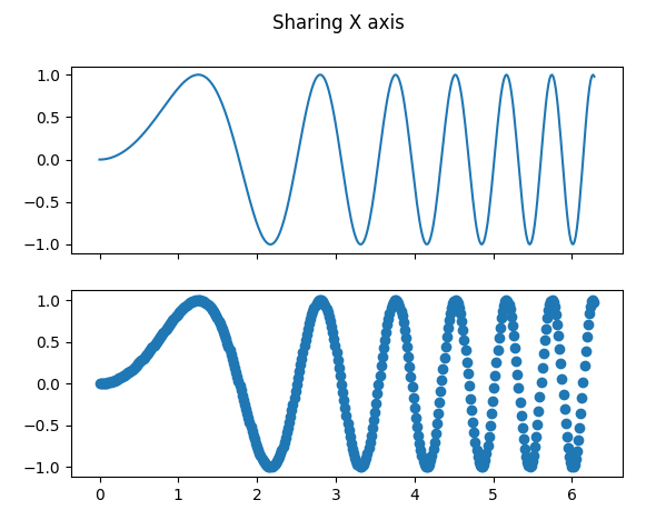
fig and axarr
f, axarr = plt.subplots(2, sharex=True)
f.suptitle('Sharing X axis')
axarr[0].plot(x, y)
axarr[1].scatter(x, y)
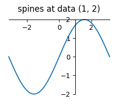
spines
an axis spine -- the line noting the data area boundaries

ax = fig.add_subplot(2, 2, 4)
ax.set_title('spines at data (1, 2)')
ax.plot(x, y)
ax.spines['left'].set_position(('data', 1))
ax.spines['right'].set_color('none')
ax.spines['bottom'].set_position(('data', 2))
ax.spines['top'].set_color('none')
ax.spines['left'].set_smart_bounds(True)
ax.spines['bottom'].set_smart_bounds(True)
ax.xaxis.set_ticks_position('bottom')
ax.yaxis.set_ticks_position('left')
柱状图
import matplotlib.pyplot as plt

data = [5, 20, 15, 25, 10]

plt.bar(range(len(data)), data)
plt.show()

# 设置柱体颜色
plt.bar(range(len(data)), data, fc='g')

# 设置不同的柱体颜色
plt.bar(range(len(data)), data, color='rgb') # or `color=['r', 'g', 'b']`

# 设置label
data = [5, 20, 15, 25, 10]
labels = ['Tom', 'Dick', 'Harry', 'Slim', 'Jim']

plt.bar(range(len(data)), data, tick_label=labels)
plt.show()

# multi bar
import matplotlib.pyplot as multi_bar_plt
import numpy as np

N = 4
# the x locations for the groups
ind = np.arange(N)
# the width of the bars
width = 0.15

fig = multi_bar_plt.figure(figsize=(10,5))
ax = fig.add_subplot(111)

# ANN, ARIMA, RNN, SG-RNN
step1 = [0.65, 0.581, 0.164, 0.134]
step2 = [0.6925, 0.892, 0.27, 0.4077]
step3 = [0.766, 0.685, 0.226, 0.52]
step4 = [0.765, 0.7068, 0.295, 0.251]
step5 = [0.802, 0.733, 0.416, 0.2551]

rects_step1 = ax.bar(ind, step1, width, color='r')
rects_step2 = ax.bar(ind+width, step2, width, color='g')
rects_step3 = ax.bar(ind+width*2, step3, width, color='y')
rects_step4 = ax.bar(ind+width*3, step4, width, color='b')
rects_step5 = ax.bar(ind+width*4, step5, width, color='k')

ax.set_ylabel('RMSE')
ax.set_xticks(ind+width)
ax.set_xticklabels(('ANN', 'ARIMA', 'RNN', 'SG-RNN'))
ax.legend((rects_step1[0], rects_step2[0], rects_step3[0], rects_step4[0], rects_step5[0]), ('Step1', 'Step2', 'Step3', 'Step4', 'Step5'))

multi_bar_plt.show()
combine multiple line labels in legend
handles, labels = plt.gca().get_legend_handles_labels()
i =1
while i<len(labels):
    if labels[i] in labels[:i]:
        del(labels[i])
        del(handles[i])
    else:
        i +=1

plt.legend(handles, labels)
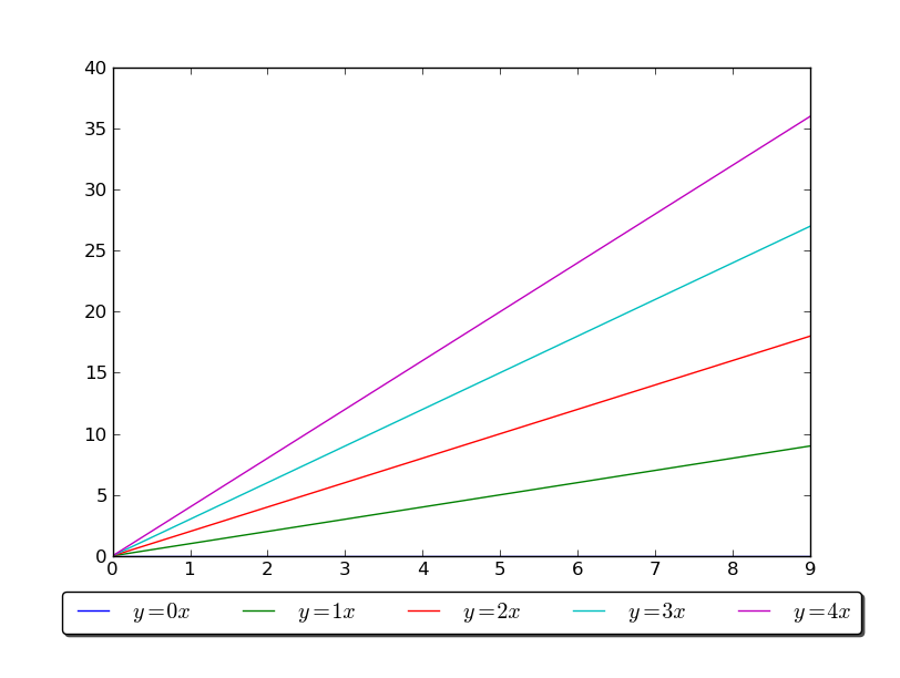
调整legend
import matplotlib.pyplot as plt
import numpy as np

x = np.arange(10)

fig = plt.figure()
ax = plt.subplot(111)

for i in xrange(5):
    line, = ax.plot(x, i * x, label='$y = %ix$'%i)

# Shrink current axis's height by 10% on the bottom
box = ax.get_position()
ax.set_position([box.x0, box.y0 + box.height * 0.1, box.width, box.height * 0.9])

# Put a legend below current axis
ax.legend(loc='upper center', bbox_to_anchor=(0.5, -0.05), fancybox=True, shadow=True, ncol=5)

plt.show()
生成eps图
# plt调用gcf函数取得当前绘制的figure并调用savefig函数
# get current figure
foo_fig = plt.gcf()
foo_fig.savefig('foo.eps', format='eps', dpi=1000)
plt.show()
误差图
fig, (ax, ax1) = plt.subplots(2, 1, sharex=True)
ax.plot(x, y1, x, y2, color='black')
ax.fill_between(x, y1, y2, where=y2 >= y1, facecolor='green', interpolate=True)
ax.fill_between(x, y1, y2, where=y2 <= y1, facecolor='red', interpolate=True)
ax.set_title('fill between where')
避免图片字体type3问题
import matplotlib
matplotlib.rcParams['pdf.fonttype'] = 42
matplotlib.rcParams['ps.fonttype'] = 42